BigCommerce onboarding flow.
In 2016, a small team of designers in General assembly, worked with the BigCommerce team to improve conversion rates for new customers by simplified onboarding process.
My Role
Collaborative project where all of us worked at every stage. I was responsible for research, UX direction & workflows.
My Team
Me along with two fellow students at General Assembly. Lead design and prototyping phase.
Context
What does BigCommerce do?
BigCommerce provides an online platform, where it’s customers can develop e-commerce websites and applications. It not only allows merchants the ability to create and host their products in online stores, but also empowers them with tools to manage orders, shipments, etc. BigCommerce also provides tools for customers to monitor customer usage through analytics.
Problems
Low converstion rate.
At this point, BigCommerce was unable to convert their trial customers into paid customers. Although a well known fact within the team, they were struggling to improve the conversions even after few re-design efforts. With some failed efforts, BigCommerce looked at the onboarding flow where they were also getting a lot of customer support requests. With the re-design of it’s onboarding flow, the company was looking at reducing customer support and improving the conversion rate. Our challenge was to identify reasons for the high dropout rate, and address them.
Solutions
Allow personalization during setup to build the emotional connection.
Firstly, we simplified the onboarding flow by streamlining it, and removing the advanced features that novice users were not used to customizing. Instead, we focused on bring forward the websited customizations that would help customers personalize their site, and hence putting in the emotional investment to their site. The goal was to allow users to quickly build their “own web store”, instead of a web store.
Reduce perceived wait time, while increasing familiarity with the system.
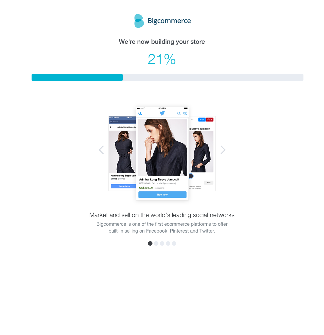
Upon learning that the system takes considerable amount of time to build the custom web application, we reduce the perceived wait time by providing feature information while customer waits. Some of these information are hidden in the system; bringing these upfront allows users to make an informed decision on the product when comparing to competitors in the market. We also provide on ongoing build status to reduce dropouts at this stage.
Approach
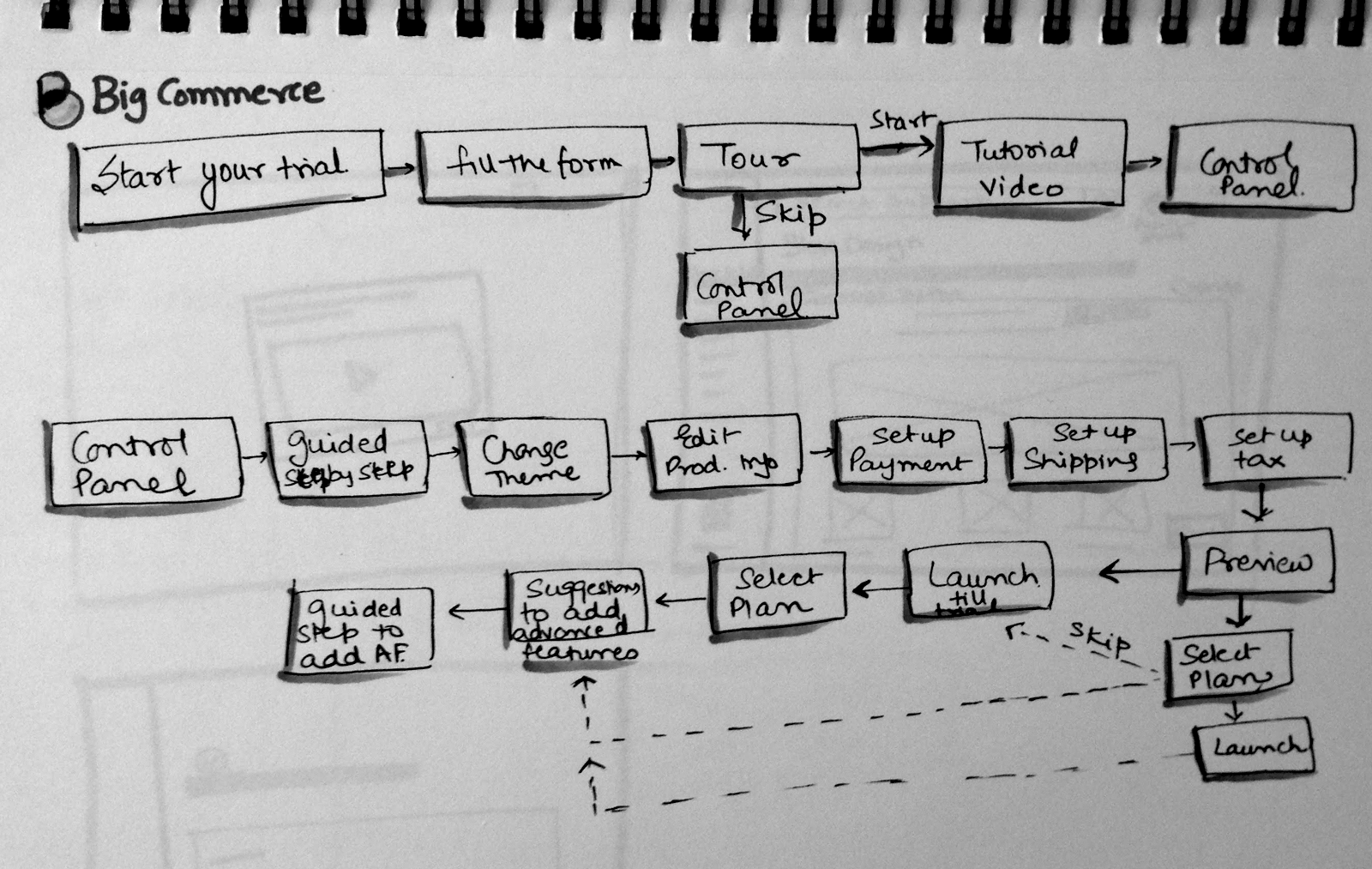
Evaluate the existing onboarding first hand.
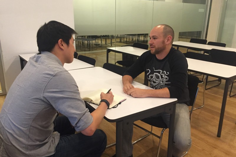
The first thing I wanted to do was to understand the current flow, that users have to go through in order to build a store. We took some of our classmates through the onboarding flow and observed them. Later, I documented the flow to highlight issues. We noted the following:
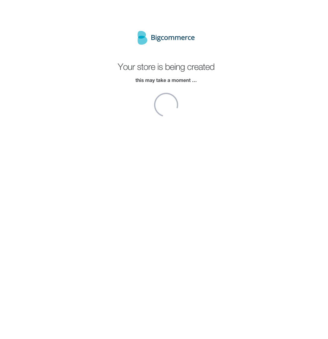
1. Dropouts in an indeterminate loader
In the fifth step, user encountered a loader that took approximately 30 seconds without giving a progress bar. This was one of the reasons for high dropout.
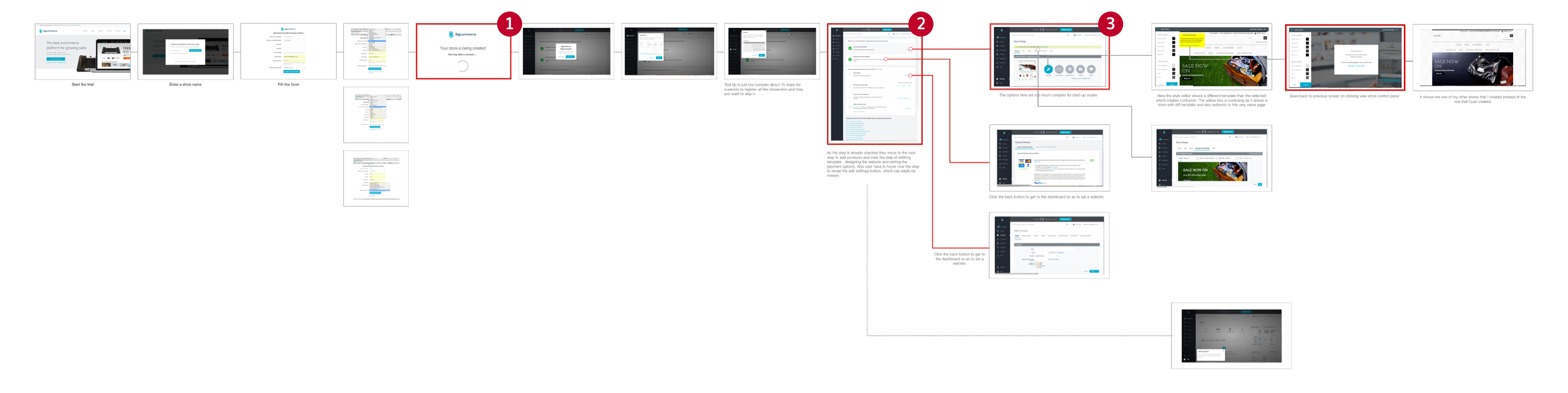
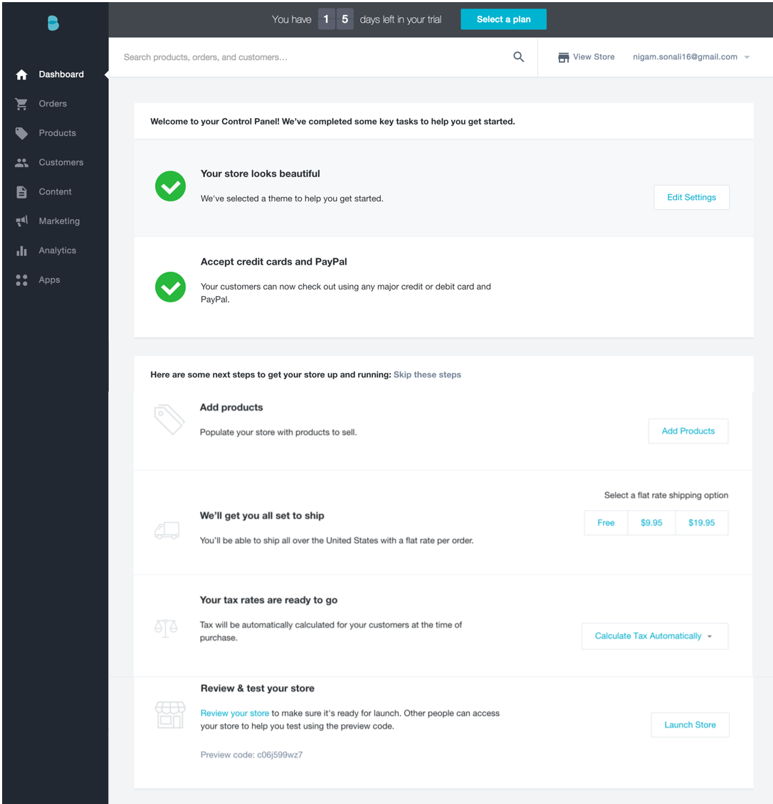
2. Checklist for initial setup
This was one area where we found a lot issues. First, some of the check-list were marked done even without doing anything. These were some important decision user needed to take to customize their store. The setup was interlinked - settings in one page affected the settings in other pages without informing the users.
3. Users get to advanced settings
In this mesh of pages, users reach advanced settings that small business owners might not even know about. There wasn't a clear distinction between basic (required) and advanced settings.
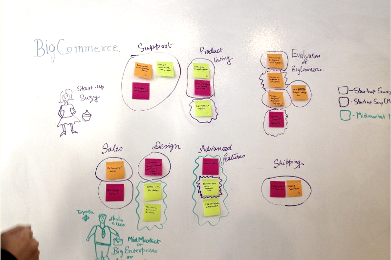
Further understand the problem space with data and existing users.
We performed a number of interviews with customer support and current and past users. We also performed walkthrough of the current setup process with some users.

Distributed Settings
During onboarding, BigCommerce exposes wide variety of settings and features, along with the full navigation. User’s spend a lot of time figuring out the unfamiliar navigation options and features.
Finding Support
The Support portal and community were not being used by majority of users as it was difficult to find.
Uncertain process to site setup
During interviews and observations, the users were unclear on steps to get their store live.
Unclear site status
Users were unclear on the site status — whether the site is live or still in testing. There was no clear indication of the current site status.
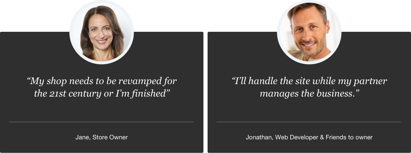
Post our research and client interactions, we focused on small business owners who were most likely to get involved in putting up their business. Some of them would roll-up their sleeves to design and publish their business site. They spend time shopping around different providers and testing their tools by building a mock site, and did not have technical teams for support.
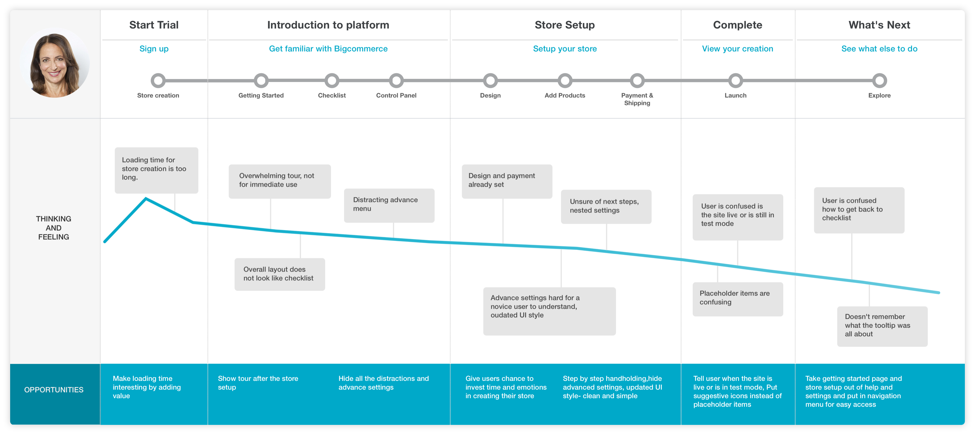
We created an empathy map for our primary persona - Jane. With this we needed to have an understanding of her emotional state during the process of setting up a store. Jane was someone who was excited about the growth opportunity with the online store but is confused looking at the options. It's scary for her to go and build up the site with so many options out there and limited technical background. We broke down the process into steps and analyzed the whole journey of Jane in process of creating her own site. It was visible that the user had to spend a lot of time understanding the platform even before they could get a website out. Most users would be lost in navigation and eventually give up without building anything.
Finding a focus with design strategy to improving the converstion rate.
Once we had a good understanding of the problem space, we jumped onto brainstorming and idea generation. It was quite clear to us that we had to streamline the onboarding process, so that users like Jane, do not have to spend too much time learning the navigation. We created workflows that would streamline the flow and hide complex features from novice users.
Our strategy in simplifying the flows was to group the similar functionalities and figure out the base minimum needed to get a site up and running. We interacted with the client to get feedback.
Sometime during the ideation, I felt that we were missing a key emotional aspect from the design. The small business owners have a strong emotional connection to their store. It is quite personal for them. I took a step back to define that. Our final proposal was three fold:
Encourage time and emotional investment
Increasing the time and emotional investment would eventually help us reduce dropout rates. We needed to focus on features that would create an attachment between the user and his online store. Hence we focused on personalization.
Streamline the onboarding process
This still remained our priority. We needed to provide an experience where user does not have to learn navigation before building their online store. We would hide the complexity of features and settings from the novice users.
Inform users about BigCommerce offerings
Most users build their web store in multiple places when they are shopping for a provider. Our proposal was to help users make that decision intelligently by understanding our capabilities.
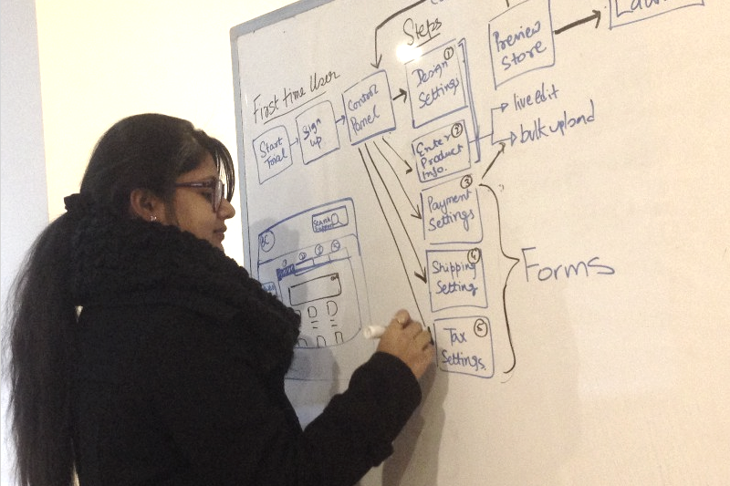
Giving shape to the strategy - workflows and wireframes.
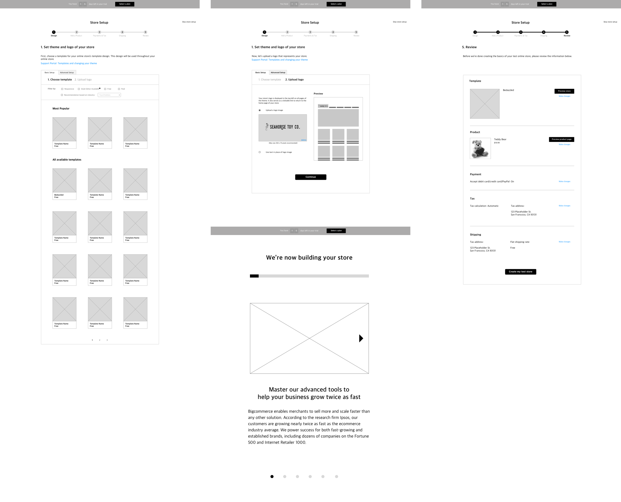
Site Setup
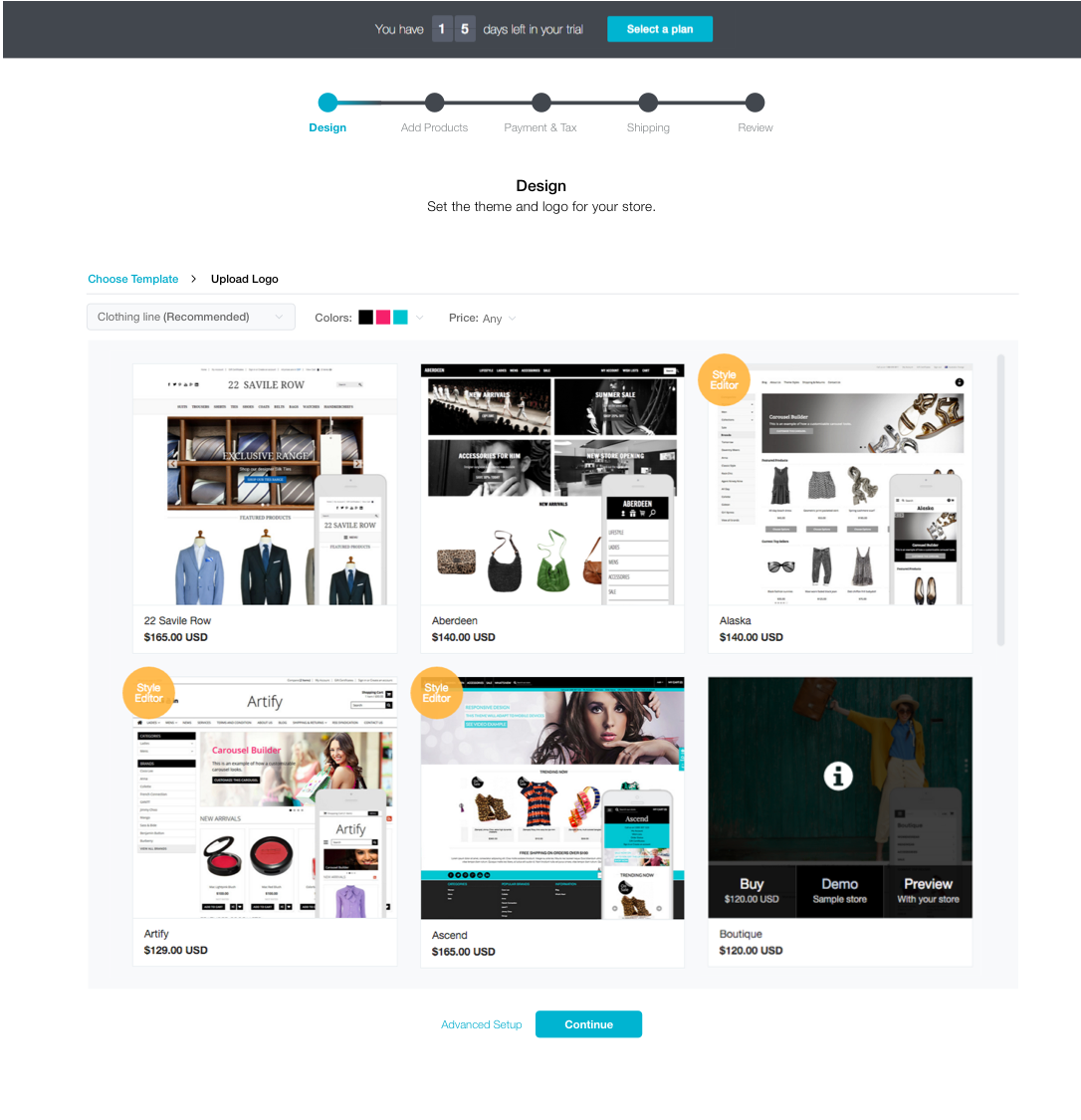
Initial step after the account creation provides a streamlined flow of customizations that users can do to call their site own. These include features like selecting a template based on their industry, selecting theme colors, adding their own products and previewing the pages before they launch.
Wait time
We use the wait time to inform users about the BigCommerce offerings. We also propose to provide a determinate progress bar, so that the users are aware of the wait time.
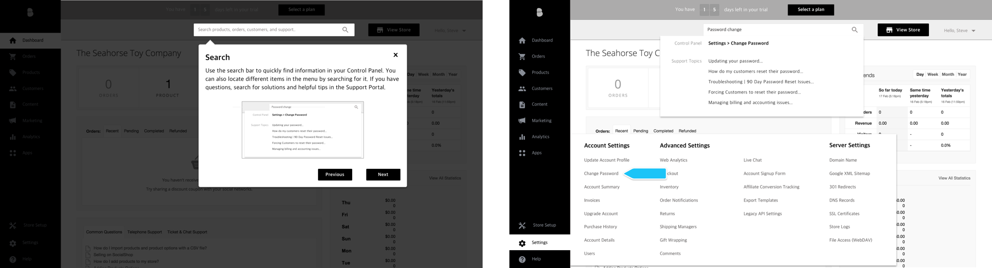
Support
Users were unaware of the support articles and called support in absence of any help. Our proposal was to integrate the support search with the current search functionality.
Low ridership in off-peak hours.
Our main findings from the usability testing sessions were:
Incomplete add product functionality
We found that people may want to add multiple products during initial set-up. This was one of the things we did debate about and were leaning to add that flexibility during initial setup. So we decided to add an option to add more products in your online store.
Other findings
Instructions weren’t prominent enough in set-up pages. Distractions-Users were tempted to click top search bar and left navigation. We got rid of all the distractions so that the users are focused on creating the store.
Learnings
Look at the problems user has beyond the UI itself.
When we started on the project, we were lucky enough to look beyond the application we set out to design. In this process, we learned a lot about the concerns that the riders were having. It also helped us focus on the infrequent riders that did not understand the MUNI transit systems well. Most of this research was outside the scope of UI, but more focused on the interactions that customers have with the entire system.